
Chart patterns vs. candlesticks
In the thousands and thousands of words written bout technical analysis, two topics always pop up frequently; charts and candlesticks. Candlesticks and chart patterns are traders’ best tools to analyze the forex market and other financial markets. However, even though some traders use both of them, they don’t know the difference between the two. In this guide, we are going to dig deeper into the subject of chart patterns vs. candlesticks and the difference between the two.
What is a candlestick pattern?
First, let’s start with a candlestick.
Well, a group of candles together tells a story and reflects what buyers and sellers are doing. What the price is doing at the moment, and what will happen next.
Candlesticks are formed by price changes that go up and down. While price fluctuations might look random at times, they can also establish patterns that traders can utilize for study or trading.
The pattern formed tells you a lot about what is going on at that specific time. It can be formed across various time frames.
Suppose you are on a 1-hour time frame. This means that every candlestick pattern will be formed every one hour. What if you are on a time frame of one week? We will leave that for you to answer yourself.
Simply put, a candlestick pattern is a method of reading a price chart.
Types of candlestick patterns
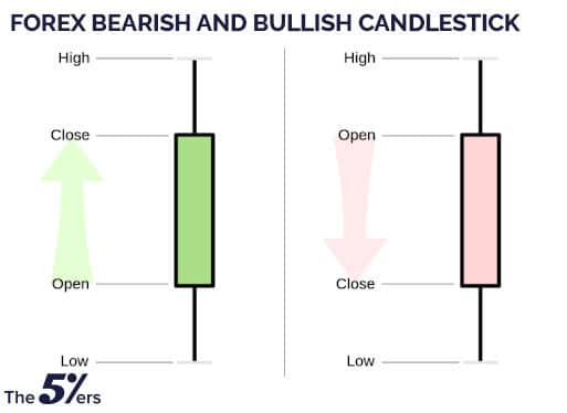
There are two forms of candlestick patterns; bullish and bearish. Bullish patterns suggest a price increase, whereas bearish patterns indicate a price decrease.
Bullish candlestick patterns
First, let’s start with bullish candlestick patterns. Here are some of the popular candlestick patterns:
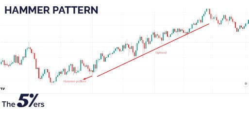
Hammer
You can navigate the hammer candlestick pattern at the bottom of a downtrend. It comprises a short body with a long lower wick.
On the chart below, we have a hammer pattern. As you can see, when the pattern appears on the chart, the price starts to move upwards. Here you can set the stop-loss below the hammer pattern.
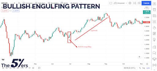
Engulfing bullish
Two candlesticks constitute the bullish engulfing pattern. The first candle is a small red candle that a bigger green candle has completely engulfed.
On the chart below, we have a bullish engulfing pattern. As you can see, when the pattern popped up, the price started to trend upwards. You can set the stop-loss below the pattern.
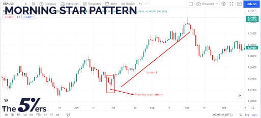
Morning star
In a market decline, the morning star candlestick pattern is regarded as a symbol of optimism. It’s a three-stick pattern with one short-bodied candle sandwiched between two long red candles and one long green candle.
The chart below illustrates a morning star pattern. As you can see, the price started moving upwards, right after the pattern.
Bearish candlestick patterns
Now, let’s check the bearish candlestick patterns
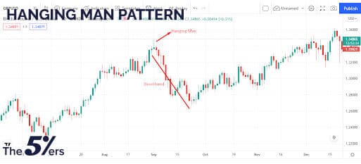
Hanging man
The bearish version of the hammer is the hanging man. It has the same shape but forms after an upswing.
On the chart below, the hanging man appears after an uptrend, and you can see that the price started drifting afterward.
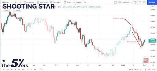
Shooting star
The shooting star looks identical inverted hammer in shape, but it forms in an uptrend: a short lower body and a lengthy upper wick.
As you can see on the chart below, there’s a downtrend right after the emergence of a shooting star.
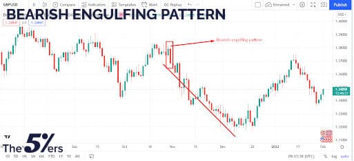
Bearish engulfing
A bearish engulfing pattern surfaces at the end of an uptrend. The first candle has a little green body engulfed by a lengthy red candle that follows.
What are chart patterns?
Now that you know about the candlestick patterns, to understand chart patterns vs. candlesticks let’s move to chart patterns.
A chart pattern is a graphical representation of price movement consisting of a sequence of peaks and troughs.
Chart patterns are phenomena marked by changes in the price of a financial asset influenced by various causes, including human behavior.
Types of chart patterns
There are two forms of chart patterns: continuation and reversal.
a. Continuation patterns
Continuation patterns assume that the price movement will stay in the same direction. Although continuous patterns occur in various forms and sizes, the most common are the triangle, pennant, flag, and rectangle.
The chart below shows you various continuation patterns. You just need to locate the patterns and then set profit-target and stop-losses accordingly.
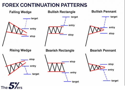
Triangles
Triangles are a common pattern defined as converging price ranges with lower lows and higher highs. Triangles are classified as symmetrical, ascending, or falling.
Symmetrical
A symmetrical triangle is a price range with a downward-sloping upper level and an upward-sloping lower level.
Ascending
An ascending triangle is formed by a horizontal upper level and a higher sloping lower level.
Descending
A falling triangle has an upper level that is horizontal and slanted downward.
Pennant pattern
Pennants are chart patterns that form after a large shift. After a significant upward or negative move, buyers and sellers usually take a breather before moving the pair in the same direction.
As a result, the price tends to strengthen and create a little symmetrical triangle in the shape of a pennant.
There are two types of pennants: bearish pennants and bullish pennants.
B.Reversal patterns
Reversal patterns indicate a trend change by going in the opposite direction of the current trend. The trend comes to a halt for a few seconds before reversing course. These patterns imply that either the bulls or the bears are losing the battle.
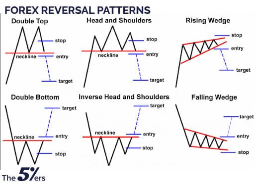
There are several additional reversal patterns, but the most common are the head and shoulders, double top/bottoms, falling and rising wedges.
The reversal patterns are the opposite of continuation patterns. As you can see, the price makes a downtrend or an uptrend move right after the occurrence of reversal patterns.
Head and shoulders pattern
The head and shoulders pattern marks a baseline with three peaks, the outside two being comparable in height and the center peak being the tallest. The head and shoulders pattern predicts a trend reversal from bullish to bearish.
Double Tops and bottoms
Double tops and bottoms are areas when the market has struggled to break through a level of support or resistance twice.
An early push-up to a resistance level is followed by a second failed attempt, culminating in a trend reversal in the case of a double top, which commonly resembles the letter M.
On the other hand, a double bottom resembles the letter W and occurs when price seeks to push through a support level, is denied, and then attempts to break the support level again.
Chart Patterns vs. Candlesticks – What’s the difference?
Now that you know all about candlestick and chart patterns, let’s discuss the differences between the two:
| Candlestick pattern | Chart pattern |
| A candlestick pattern is formed by combining one or more candlesticks. | When the price fluctuates as a reflection of psychological and fundamental factors over a lengthy period of time, a chart pattern emerges. |
| Candlestick patterns occur in a brief period of time. | Chart patterns usually pop up on longer timeframes |
| Candlestick pattern marks for quick entry and exit points. | Chart patterns best suited for long-term buy and sell signals. |
| Candlesticks patterns suggest trend direction for a short period. | Chart pattern illustrates the trend for a longer period. |
Chart patterns vs. candlesticks final thoughts
So, there you have it!
Now you know what candlestick and chart patterns are and we know all about Chart Patterns vs. Candlesticks.
Remember that candlestick and chart patterns can appear frequently, so to remove any market noise, it’s best to use technical indicators along with them.


